The Design Life of a Paperless Architect
Architect Craig Burns shares his paperless design workflow on iPad in our Architectural Design Q&A.
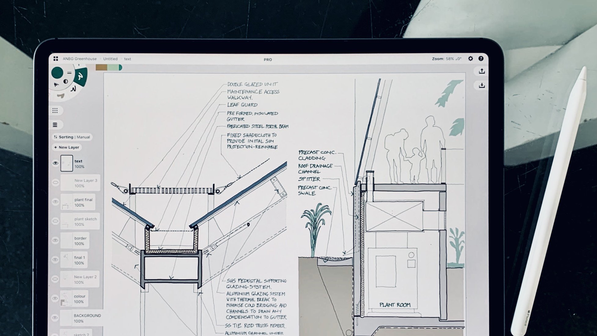
We first released this interview with Craig Burns in May 2017. He has been an excellent support for our team and we recently asked if we could update and reshare the article. He immediately turned around updated screenshots and a revised wishlist, yet the workflow he shared originally is still completely relevant and going strong. Craig is still creating meaningful design solutions without paper. Updated April 2021. - The Concepts Team
"Since starting to use the iPad Pro, my overall process is still very much the same, but it has become more streamlined and effectively paperless."
Craig Burns - I’m a Practice Director at BVN in Sydney, Australia. We are an Architecture / Design practice with about 350 staff spread across Sydney, Brisbane, London and New York. We do a wide range of project types from individual houses to large scale hospitals, taking in almost everything in between (office buildings, workplace, schools, universities, laboratories, residential, sports, defence etc.). If you want to get a better idea of what we do, the best bet is to look at BVN’s website.
I studied at The Mackintosh School of Architecture in Glasgow and worked in London (at SOM, KPF, Koetter Kim) for about 9 years before moving to Sydney nearly 25 years ago and joining BVN.
What is your design process like? You shared a post about going paperless for work and adopting the iPad Pro as your main design tool. What have been the advantages and disadvantages of these decisions to your productivity? How has a mobile lifestyle affected your workflow?
The blog post you referred to describes the various tasks which make up most of my workload. If you are interested, you can read it here. For this discussion, I’ll stick to the more design-based tasks.
The nature of the design work I do is largely based on the requirements of the projects I’m working on at the time. It can range from high level master planning and concept sketches through to 1:2 details. Generally the process is similar regardless of scale. I usually start with some form of underlay or setup background (site plan, CAD section with key geometries, 3D visualisation, context photograph etc.).
I typically run through a lot of very loose iterative sketches which explore a particular idea. Sometimes I have definite thoughts which dictate what the pen does and sometimes the pen does things which begin to suggest ideas. When the pen begins to slow down, I go back to the beginning and try to follow a different idea until the pen slows down again.
The process basically looks like this:

The tools at the beginning of this process usually need to be accessible, intuitive and fast to use. Traditionally I would do this with reams of tracing paper and artline pens. I always used A4 or A3 white tracing paper because it was easy to put in a copier/scanner and would look neat when pinned on a wall for client meetings. Rolls of yellow trace were always messy in this regard — a lesson I learned from SOM (earlier practice I worked at). I also rarely used pencils, always pens — a throwback to being traumatized by my professor at the MAC who insisted that “pencils were for people who made expletive mistakes”…. I used to use reams and reams of trace. My desk (and most of the floor around it) would disappear under it until the editing process would kick in and I’d have to decide what to keep and what to discard.
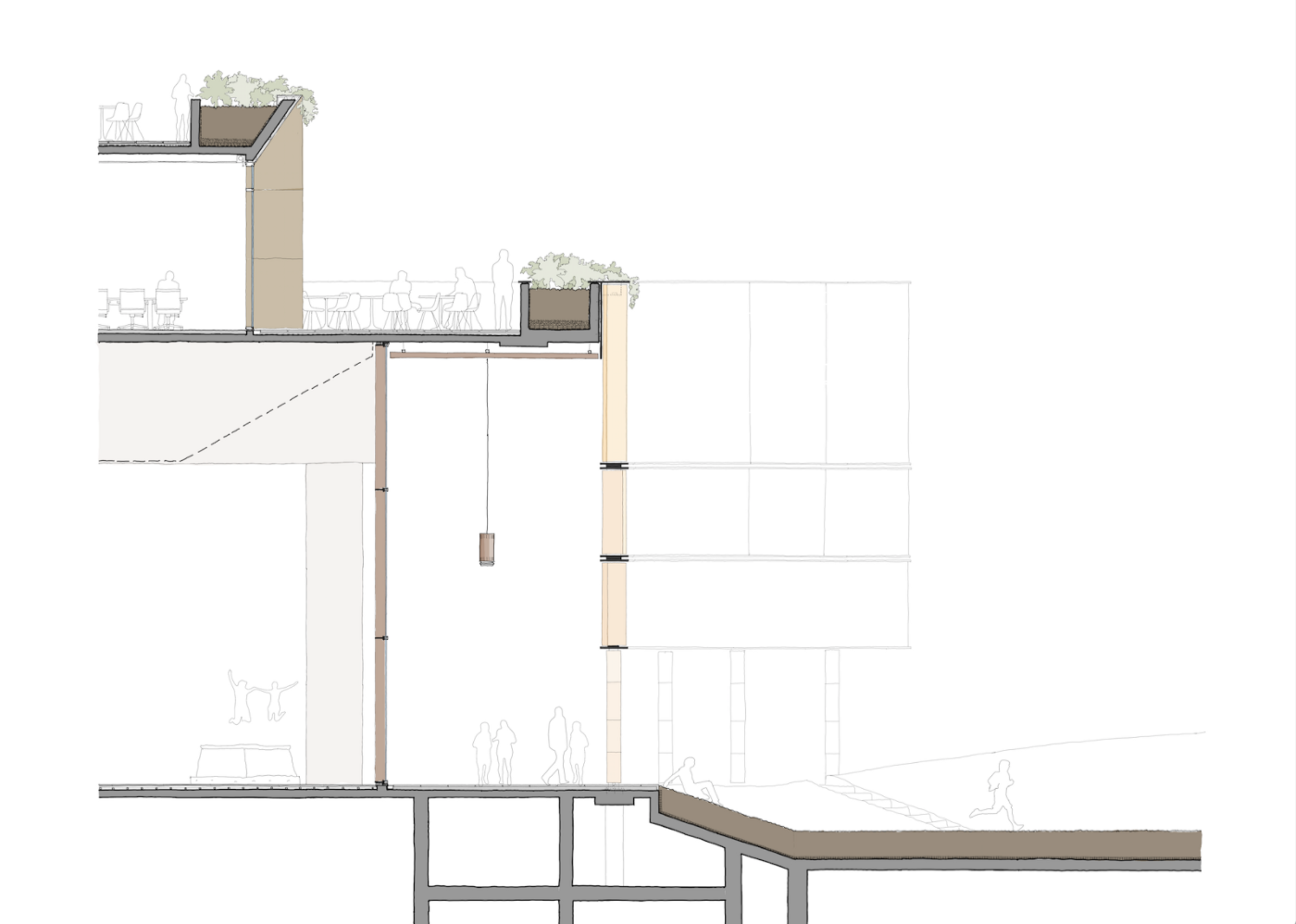
The second stage of the process was to refine the design and make it conform to the reality of the architect’s existence. It had to be accurate, to scale, and drawn convincingly to convey the correct intent and to appear credible as a buildable solution. Sometimes I would do this as more accurate hand drawings on trace, sometimes as 2D CAD drawings in Microstation. Frequently I’d set the drawing up in Microstation to establish accurate scale and geometry then print it and draw iterations on trace over the top. Depending on the output, I’d add colour with Pantone pens either on a print or on the back of the trace. I imagine this is very similar to the process used by most architects (certainly those of my vintage).
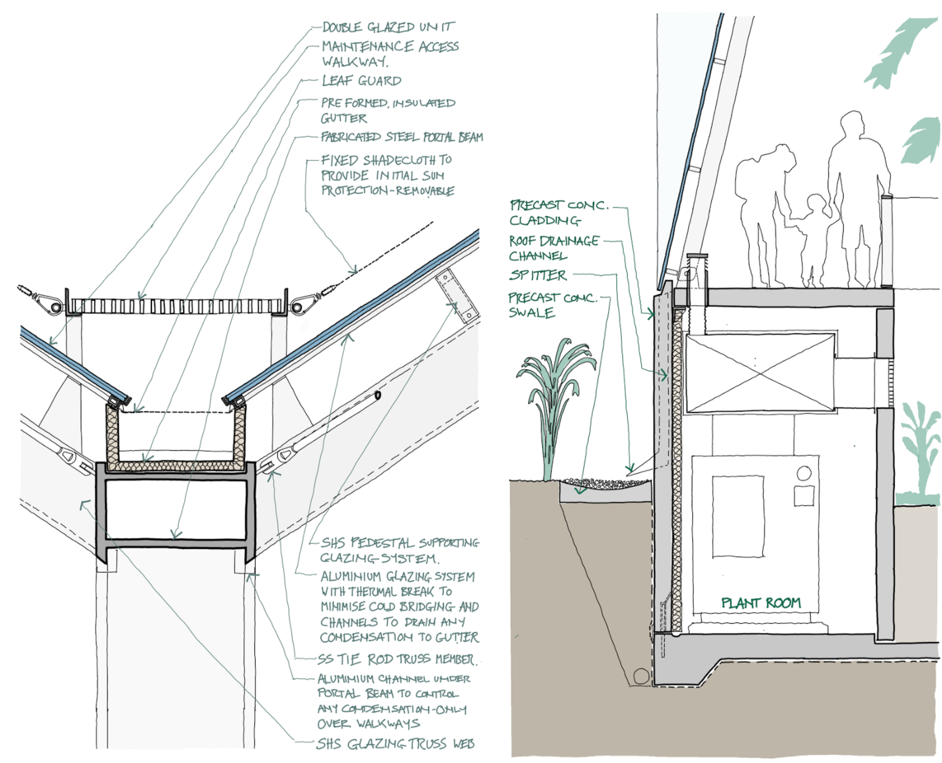
Since starting to use the iPad Pro, my overall process is still very much the same, but it has become more streamlined and effectively paperless.
The iterative process is much quicker and the editing process is pretty smooth. The main advantage is that I can do it almost anywhere: airport lounges (and in the air), sitting in a café, whilst in meetings etc. Because I only need the iPad and Pencil, I am always ready. No more frustration when I realise I forgot to pack enough trace, or the 3 different pen thicknesses, or my favourite colour of pantone, or can’t get access to a scanner….
When it comes to the credible drawing stage, the ability to manipulate hand drawn line-work in a similar way to CAD elements is a revelation! I can draw lines, then move / copy / mirror / scale them, as well as changing colour, line weight etc. In my previous life, the most frustrating thing was when doing a ‘final’ sketch which was going to be presented to the client and after 20 minutes of careful line-work, making a mistake with the last line. The dilemma typically becomes: 1) Redraw the whole thing (the OCD option). 2) Reach for the eraser / whiteout / razor blade (the pragmatist option). 3) Do nothing and hope no one will notice the mistake (the all-nighter option). I love being able to sketch by hand in pen and still have the ability to ‘fix it up in post production’ without any loss in quality. Love it… lots…
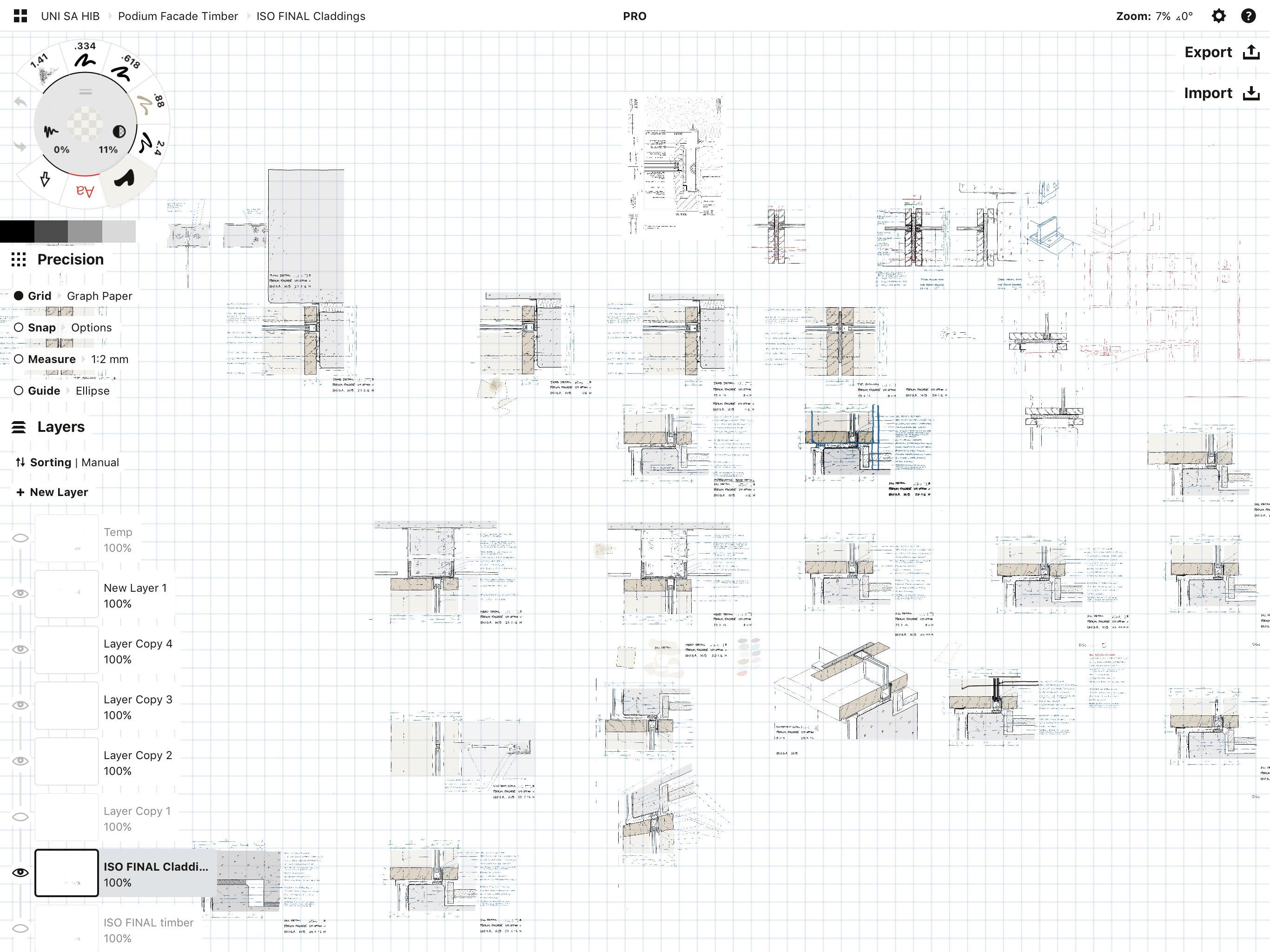
I frequently produce suites of details for façade systems and frequently have a number of options for each condition. With Concepts I can group line-work etc. to create components, which I can then copy and use as the basis of a new option or a similar detail. This is much quicker and neater than doing the same thing with paper. A couple of years ago we had a project which involved over 60 new buildings on a defense base. I hand sketched every façade detail for all of the buildings on A3 trace. It was a mammoth task which I think could have been reduced by half if I had the iPad Pro and Concepts available at the time.
The other productivity bonus is to sketch ideas in meetings and throw them up on a big screen in real time, then send them to the attendees while they are still in the meeting. When you come out of the meeting, there is nothing else to do, you move onto the next task rather than the traditional collate, scan, email, file hard copy, have coffee break routine….
Being able to do all this while being completely mobile is also a big bonus. I can work without a fixed desk space which is great in terms of flexibility, particularly in a practice where we move desks constantly.
The only downside I see is that there still has to be an element of housekeeping. I still need to switch between my Citrix network environment and the iOS environment and transfer files between both. The iPad Pro doesn’t allow me to copy things directly from one environment to the other so I typically use OneDrive to transfer directly from Readdle Documents’ excellent file manager. This works fairly efficiently, but I still need to be rigorous to ensure that I don’t have stuff living solely on the iPad which isn’t on our network (in case I get hit by a bus…..). Ideally, I’d like to see an ability to copy/paste directly from iOS to Citrix and vice versa.
What tools and programs do you use in your architectural design process? How does Concepts fit into your workflow?
With limited exceptions, I use the iPad Pro as my only day-to-day hardware (apart from my phone). Once a month or so, I will use a desktop computer for any tasks which need more screen real estate, large schedules in Excel for example. It’s worth noting that I don’t typically work in Revit and rarely use CAD since we moved from Microstation as our main CAD platform. (I have used Microstation on the iPad Pro through Citrix… it’s a little laggy but still usable). Most people in our practice use Revit / Rhino / Grasshopper daily.
I use Readdle Documents / PDF Expert for local file management and for its markup capabilities. Our practice uses Citrix combined with thin clients for all of our computing and this allows me to directly access our network using the iPad. Using Citrix Receiver, I can log into my virtual desktop and work pretty seamlessly in a networked, windows environment. This has occasional hiccups but in general works reasonably well.
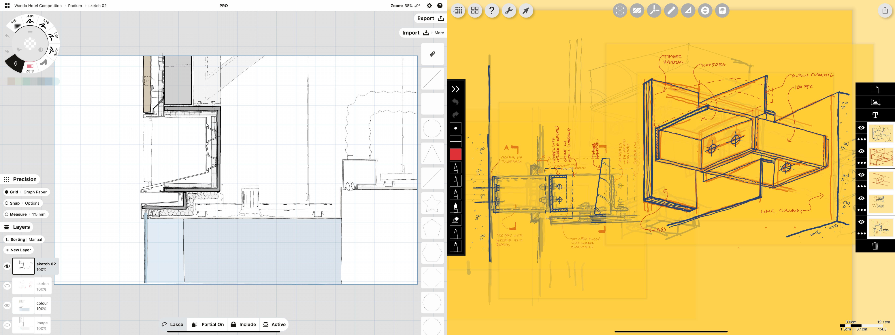
For drawing and sketching I use two main tools, Concepts and Morpholio Trace. Typically I use Trace for the loose, iterative sketching and move to Concepts when things start to get more real. If I’m more sure of my starting point (say for 1:2 façade details), I’ll start in Concepts.
Would you be willing to share images that show your process, from idea to finished plan?
My first question typically is, where to start? This is determined by the next set of questions… Do I have background information to use? What is the final output going to be? How much detail is required? Am I refining something which is already conceptually defined? Am I attempting to define what the concept is?
Simple coordination sketches:
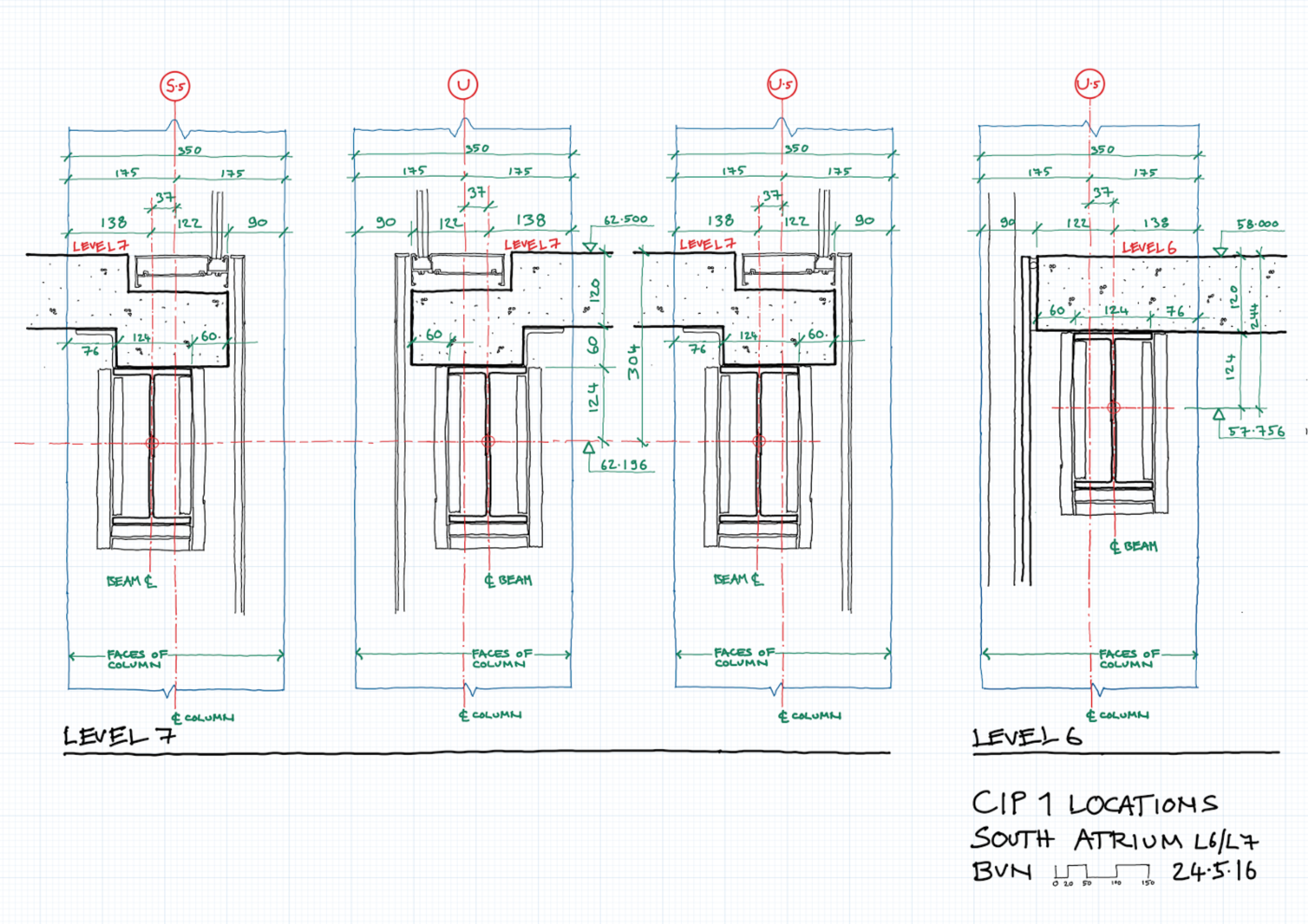
This example is a sketch issued to a managing contractor to show detailed setout of steel and concrete profiles to allow shop drawings to be prepared. It is simple and makes no real attempt to be a pretty picture:
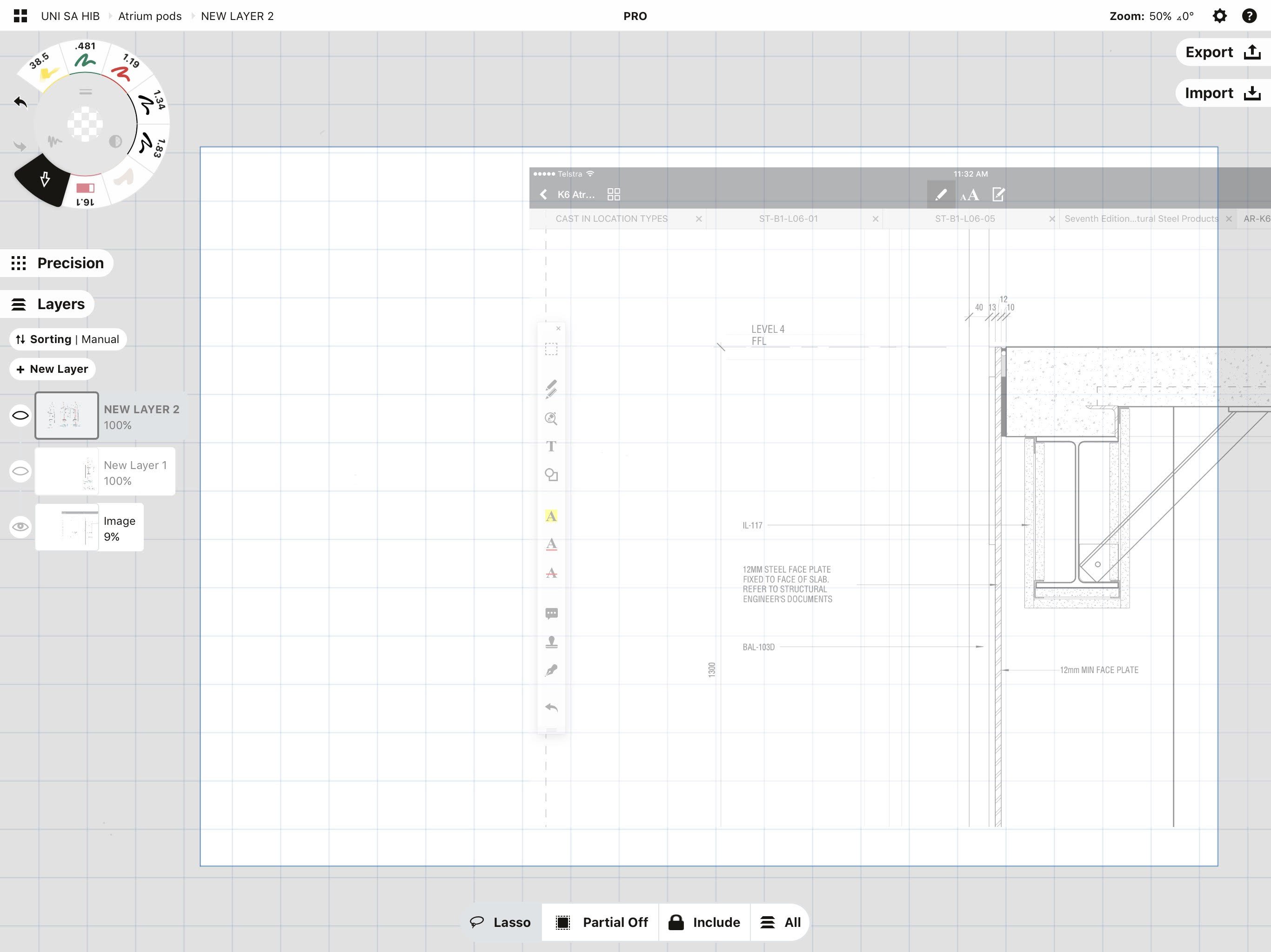
I first set up a scale grid and paper size based on what I think the output will be (in this case 1:5 at A3).
I usually bring in a background image to draw over. Usually this has been a screen grab (JPG/PNG) from a PDF viewed in Documents. This will change now that Concepts can import PDFs directly. The main issue here is making sure the image is at the correct scale. I usually have to make it pretty transparent and then scale it to match the grid background. This is a bit cumbersome, unfortunately. There is probably a quicker, easier way to do this but I haven’t found it yet. The ‘assign scale‘ function within Trace does this really, really well. In this example, I have brought in an image originally generated from our Revit model.
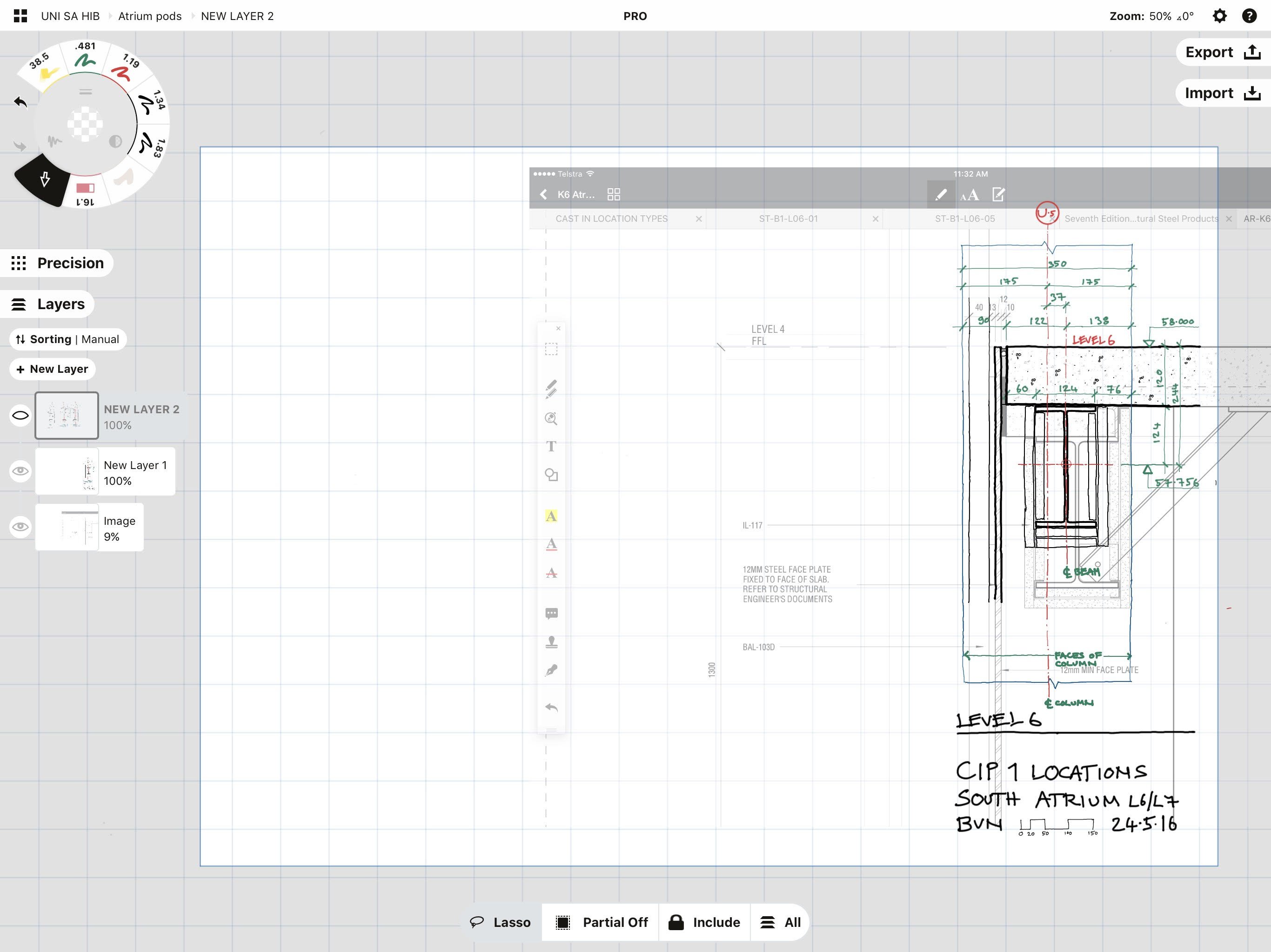
I will assign some layers depending on how complex the task is and start drawing. This example is very simple so didn’t really need lots of sketch layers or options layers.
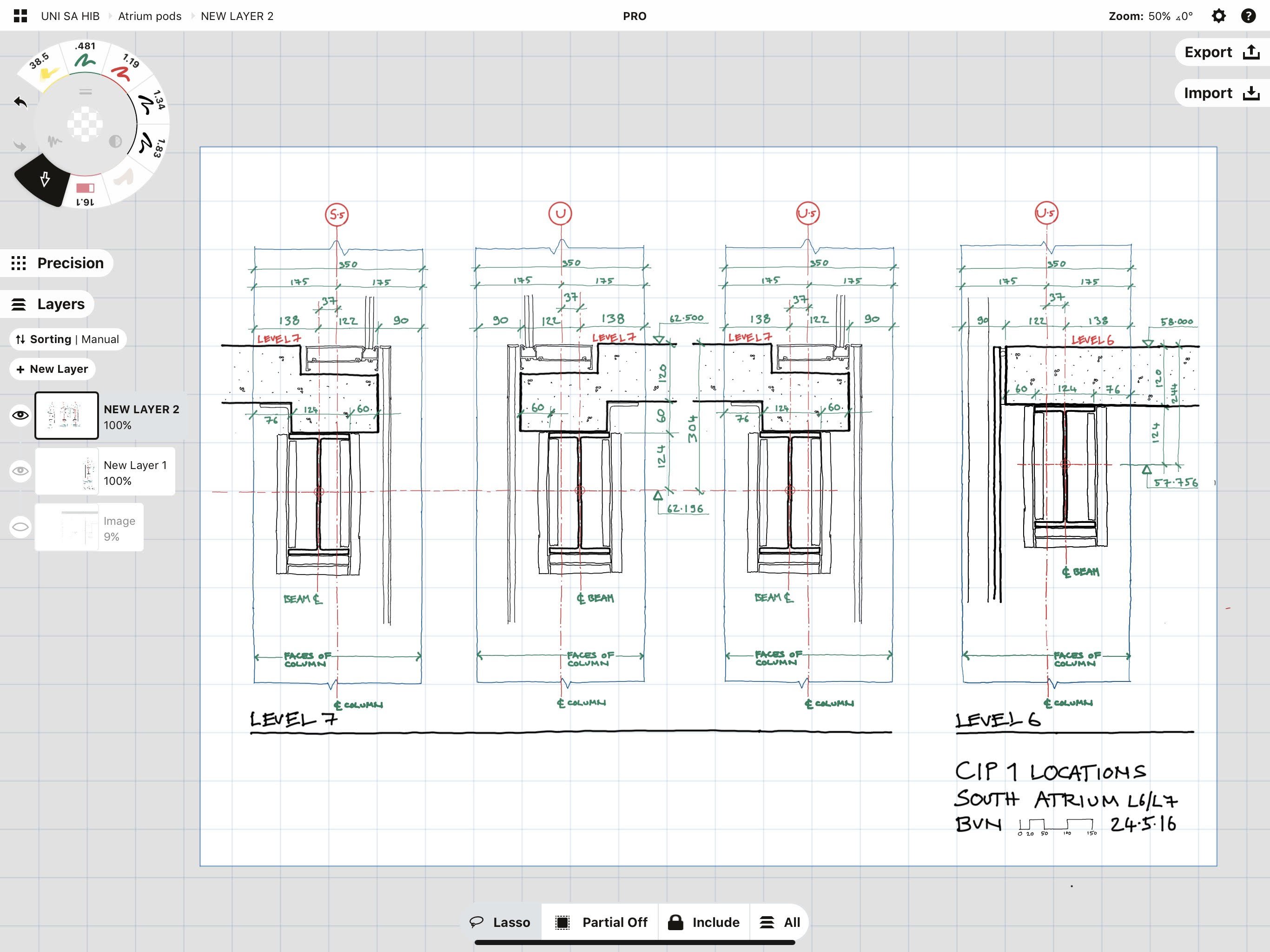
Once the first condition is drawn, I duplicate it alongside. I can then modify it to represent a different (but similar) condition. This is perhaps Concepts’ best function, the ability to copy and then make small changes to a drawing without having to redraw the whole thing. I’ll add text and dimensions as required, usually in different colours for clarity.
Finally, I switch off the initial image and any other things I don’t want to see, then export.
In the past I would export as a 300dpi PNG file to Readdle’s PDF converter and then file the PDF in documents, where it can be easily uploaded to Aconex and distributed to the design / building team. I can now export it as a PDF direct to documents from inside Concepts, which is an excellent, recently-added function. (It’s a function I asked for a while ago and the Concepts crew were really responsive. They asked lists of questions about detailed functionality and told me it would be implemented in a future upgrade… Brilliant! This feedback loop and fast implementation of new functionality is amazing.)
Detail design sketches — concept already clear:
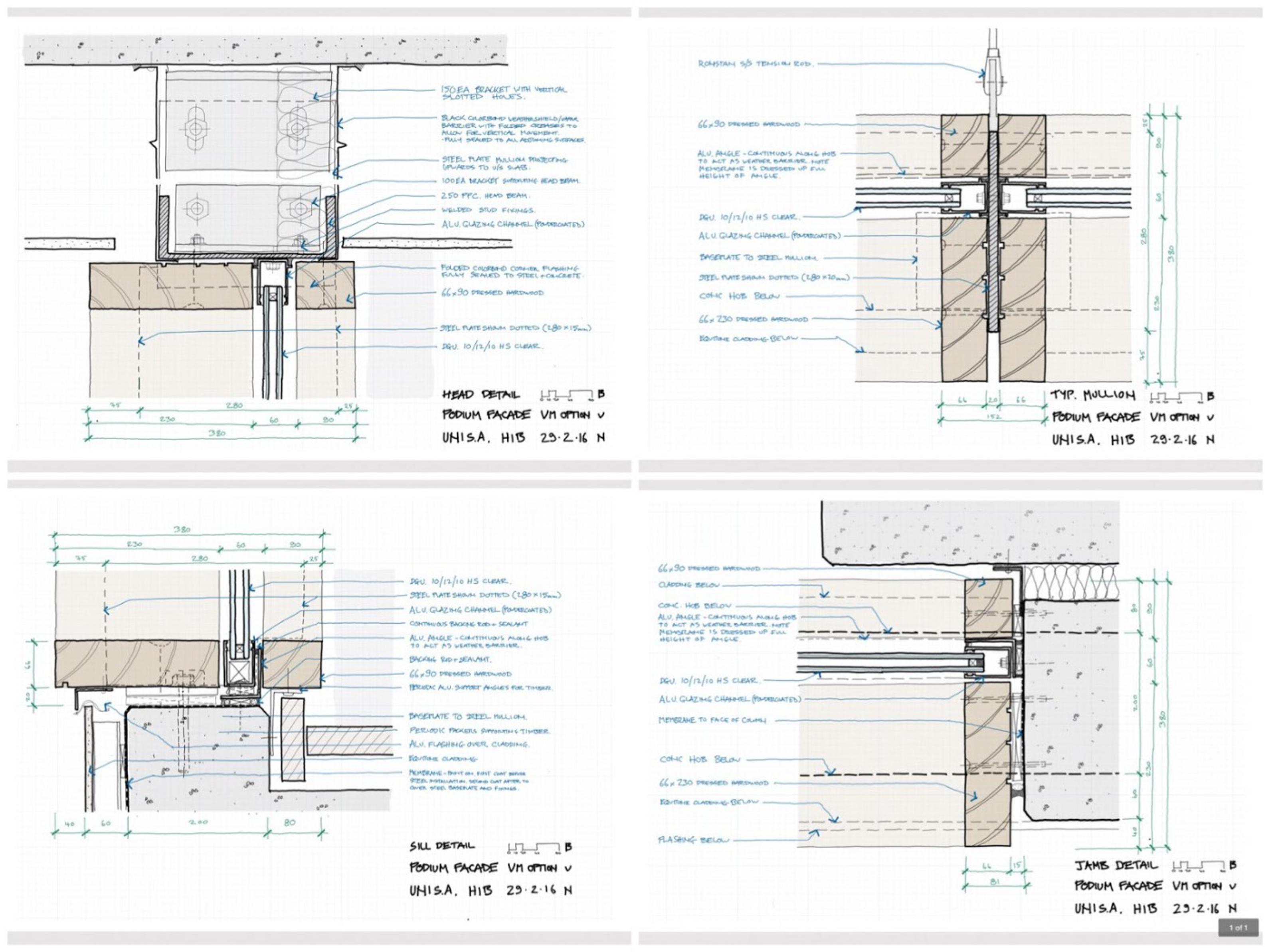
This example shows the detailed design of a façade system comprising aluminium framed glazing / steel structure / timber mullion cladding. The system had fairly well-defined geometry and material parameters already (this was the 3rd or 4th iteration of this façade design), so I felt comfortable beginning directly in Concepts without any background.
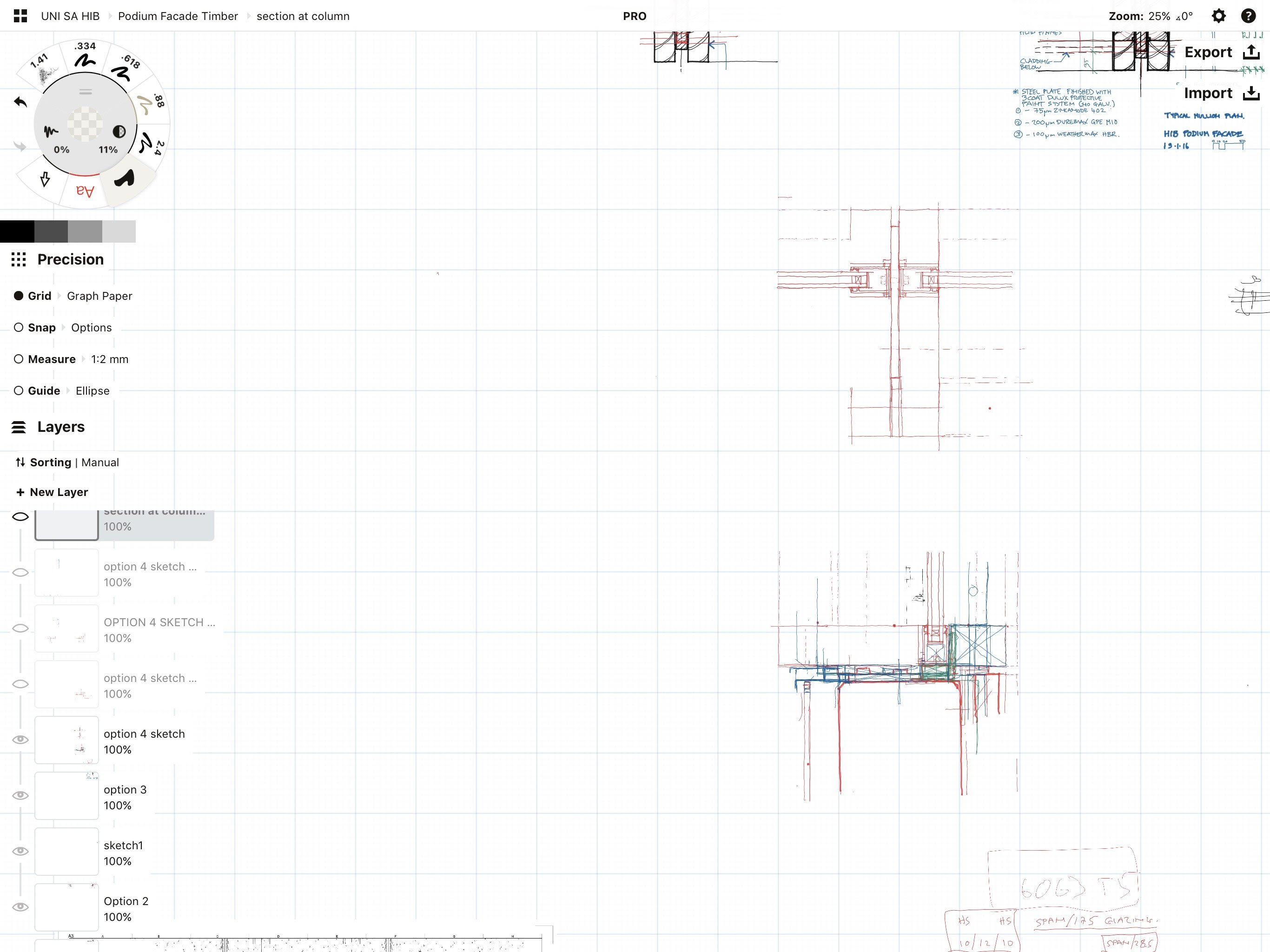
As before, first step is setting up a grid and scale, in this case 1:2. I left the paper size set to infinite as I knew there would be lots of different conditions to draw.
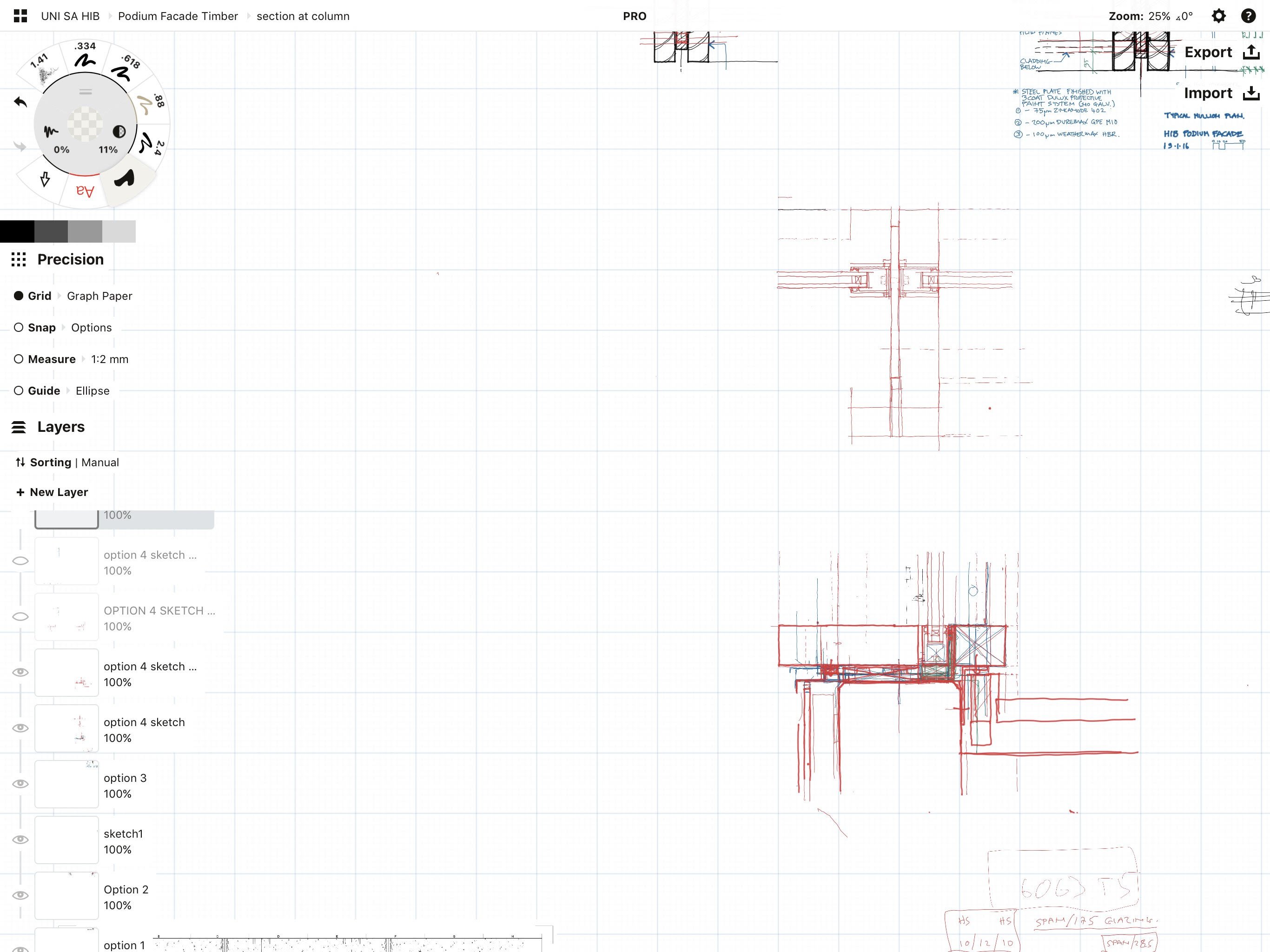
I set up a sketch layer and start drawing rough ideas of how the detail might be resolved. I’ll keep working in this layer until I have reached a decision point where a particular part of the design becomes relatively fixed or get to a point where it gets unclear. I might change pen colour, but more usually I create another sketch layer and keep working.
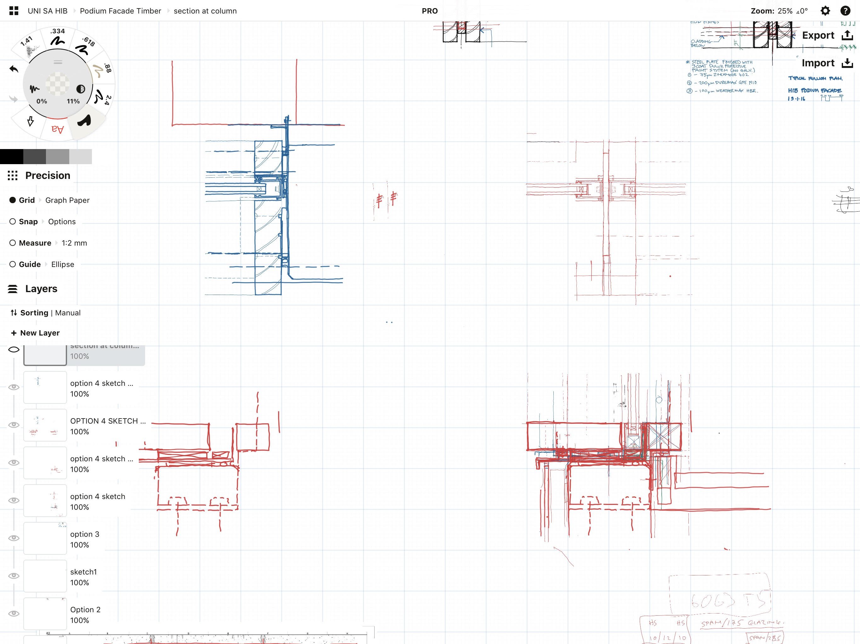
In this case, I’m starting with a sill detail but as this starts to reach a level of resolution, I start working on head, jamb and mullion details for the same system. As I work through these other details, they may throw up issues which mean I have to modify the design and change the original sill detail. This is where Concepts excels. The ability to group / duplicate / modify makes these small adjustments really easy to do.
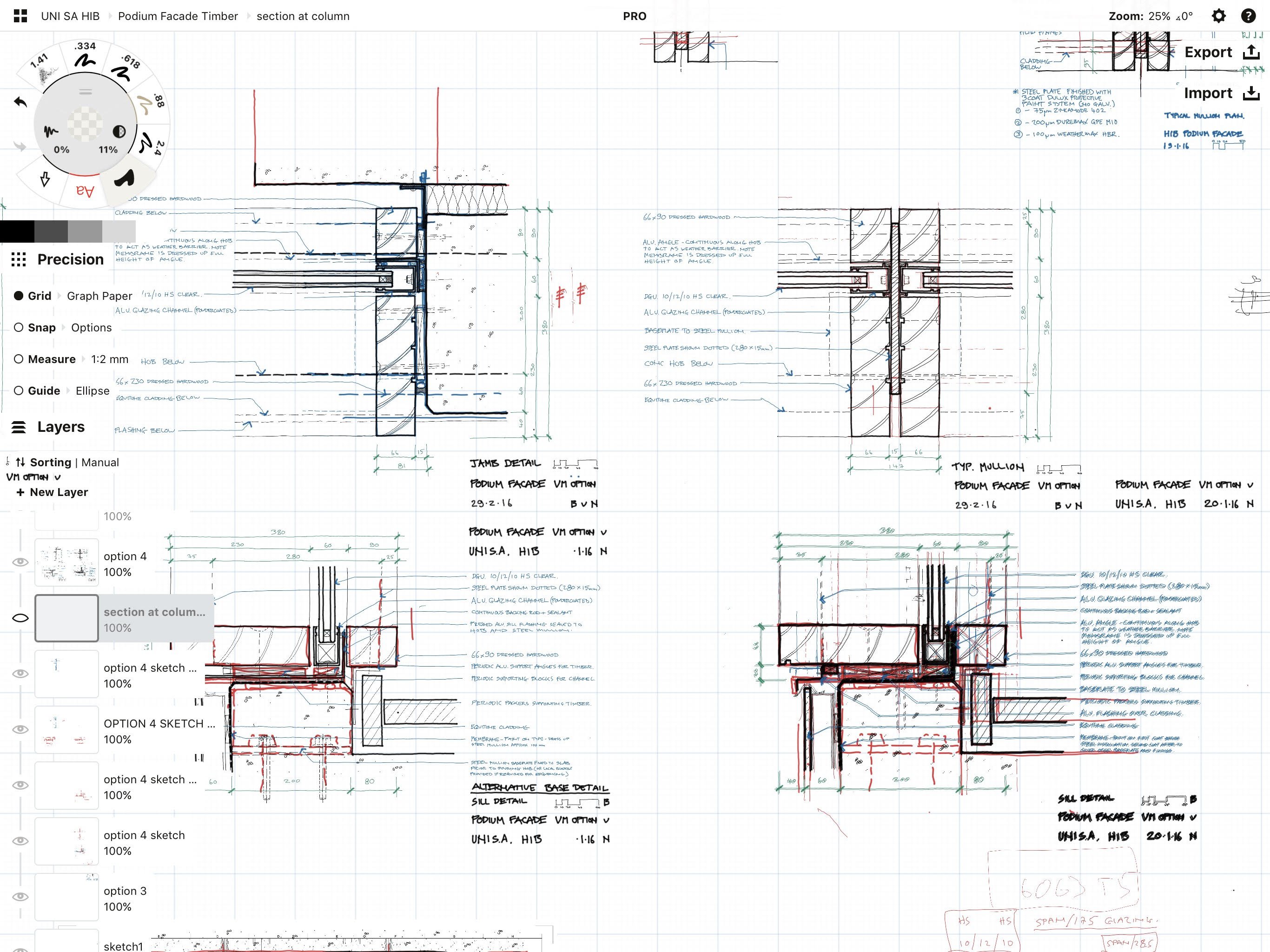
Once I’m happy with the detail resolution across all of the details, I create a final drawing layer and start the final drawing. I usually keep colour and text on separate levels, but in this case I put the text on the same level as the drawing (can’t remember why in this case). As above, being able to easily copy and paste the text from one detail to another is vital.
Lastly, I’ll add colour.
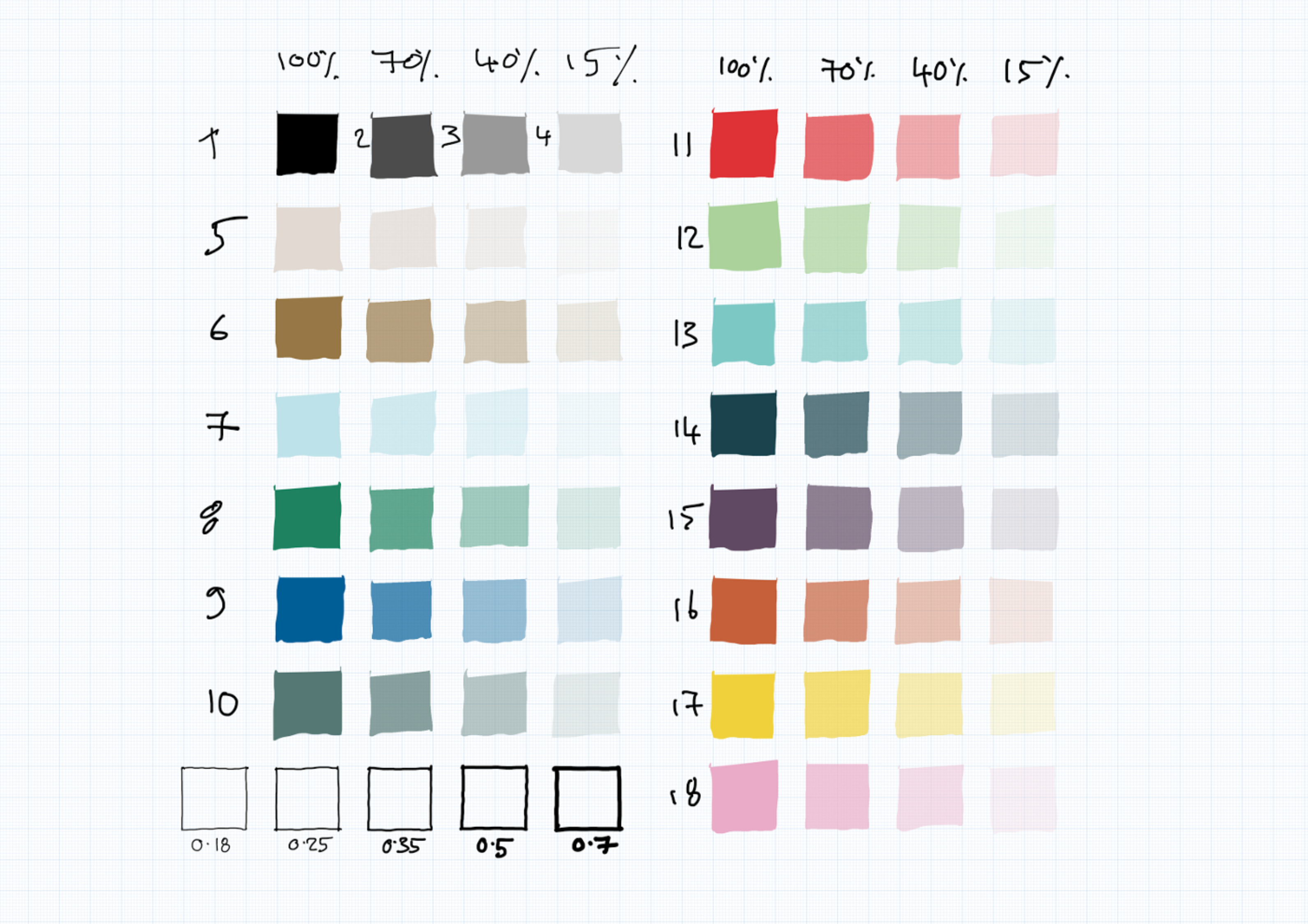
Our practice has a graphic style guide which includes a series of colours that are used across all of our platforms and all of our projects. This means that any presentation we do always looks consistent regardless of the different sources used to generate it. While the Copic marker colours are excellent (I’m more familiar with Pantone as a brand but the principle is the same), I was really happy that Concepts allows the creation of custom colours. Our style guide gives RGB and HSV values for our colours so it was easy to set up my Concepts colour palette with these colours. The style guide is effectively an open source document so if you want to have a look at it, go here.
The fill tool is one of my favourites! Adding colour is easy and makes sketches look much more meaningful.
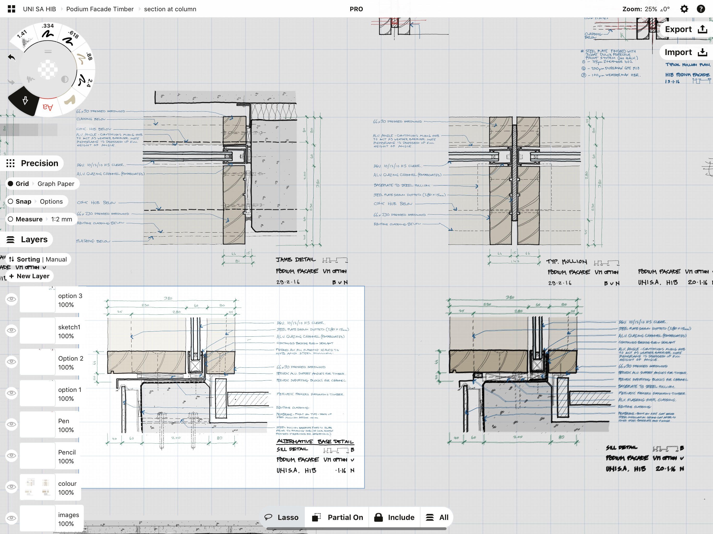
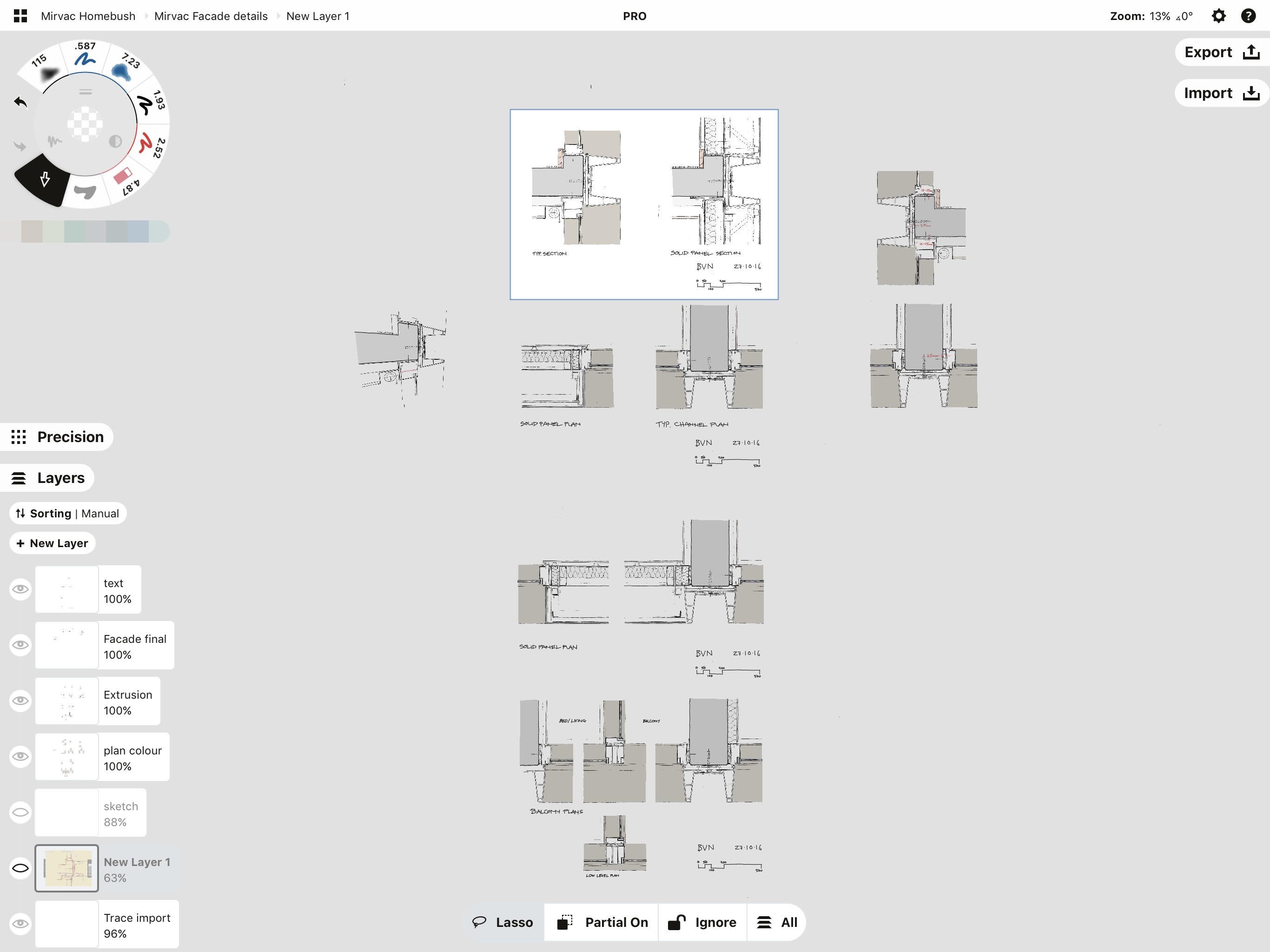
The final version in Concepts looks like this. When I’m ready to export, I switch off the grid, set the paper size to A3 and export the configured size for each sketch.
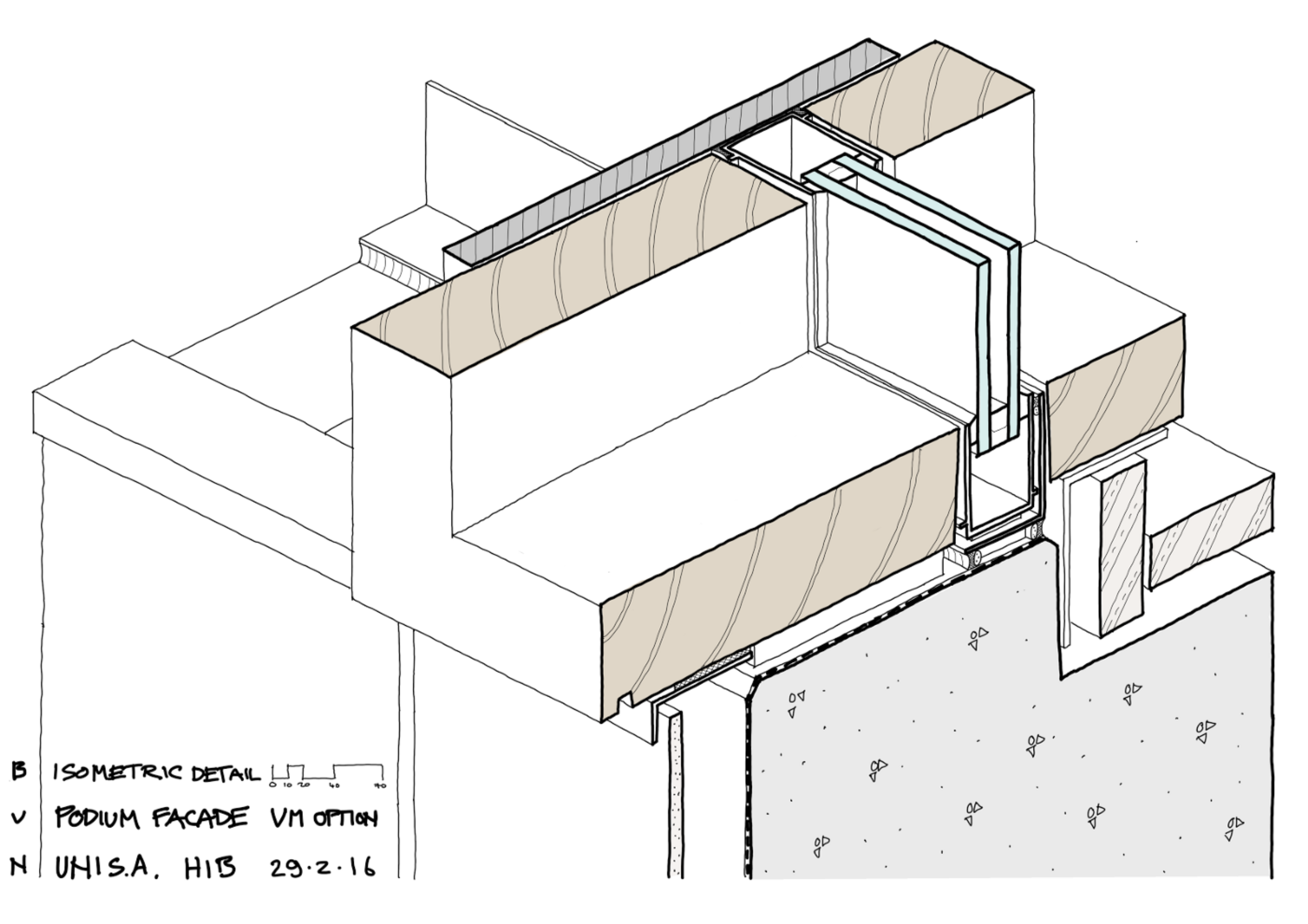
As well as the basic details for this, I also produced a small series of cutaway Isometric sketches to help explain the construction sequence and describe one of the more critical junctions.
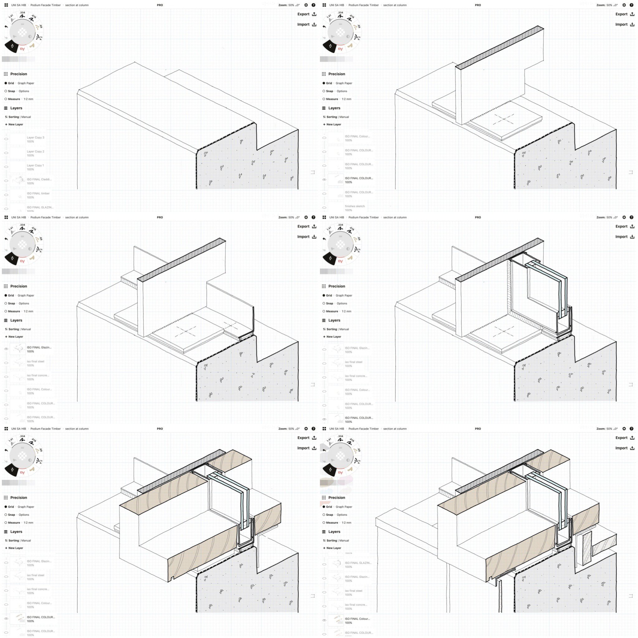
These sketches were set up using the Isometric grid as a background and put together the same way as the previous sketches. Each stage has a different layer so they can be switched off and on in the correct order. In this case, I would draw the initial sketch, then copy the layer and rename it. This new layer would become the basis for the next stage. When finished, I’d repeat the process until all the stages were complete.
Detail design sketches where concept is not really defined:
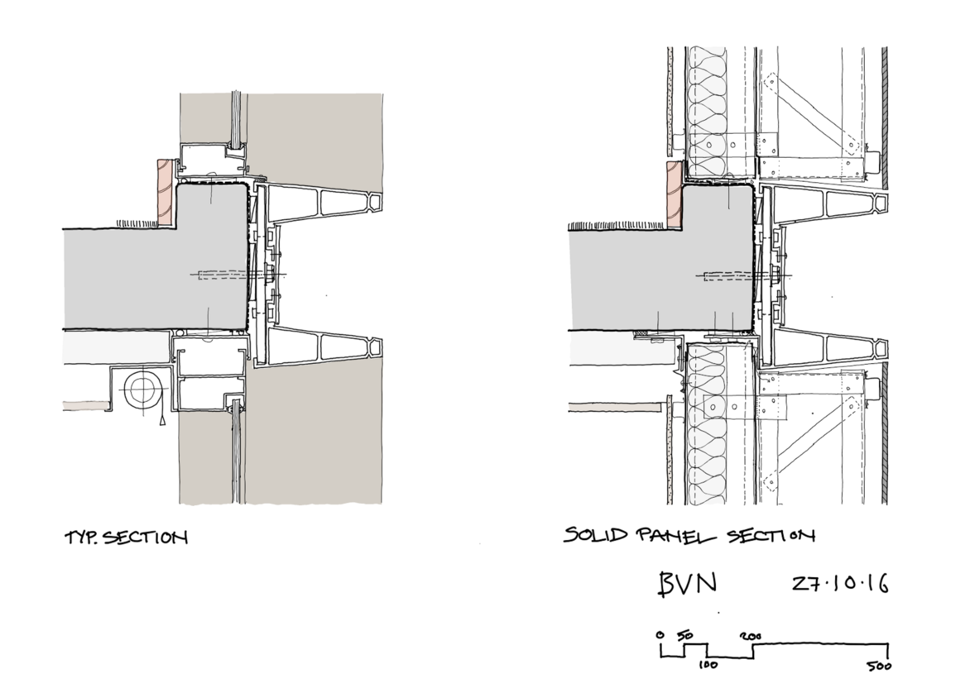
These sketches are used by the cost planner to assess budget allowances and by the Managing Contractor to assess buildability and sequencing.
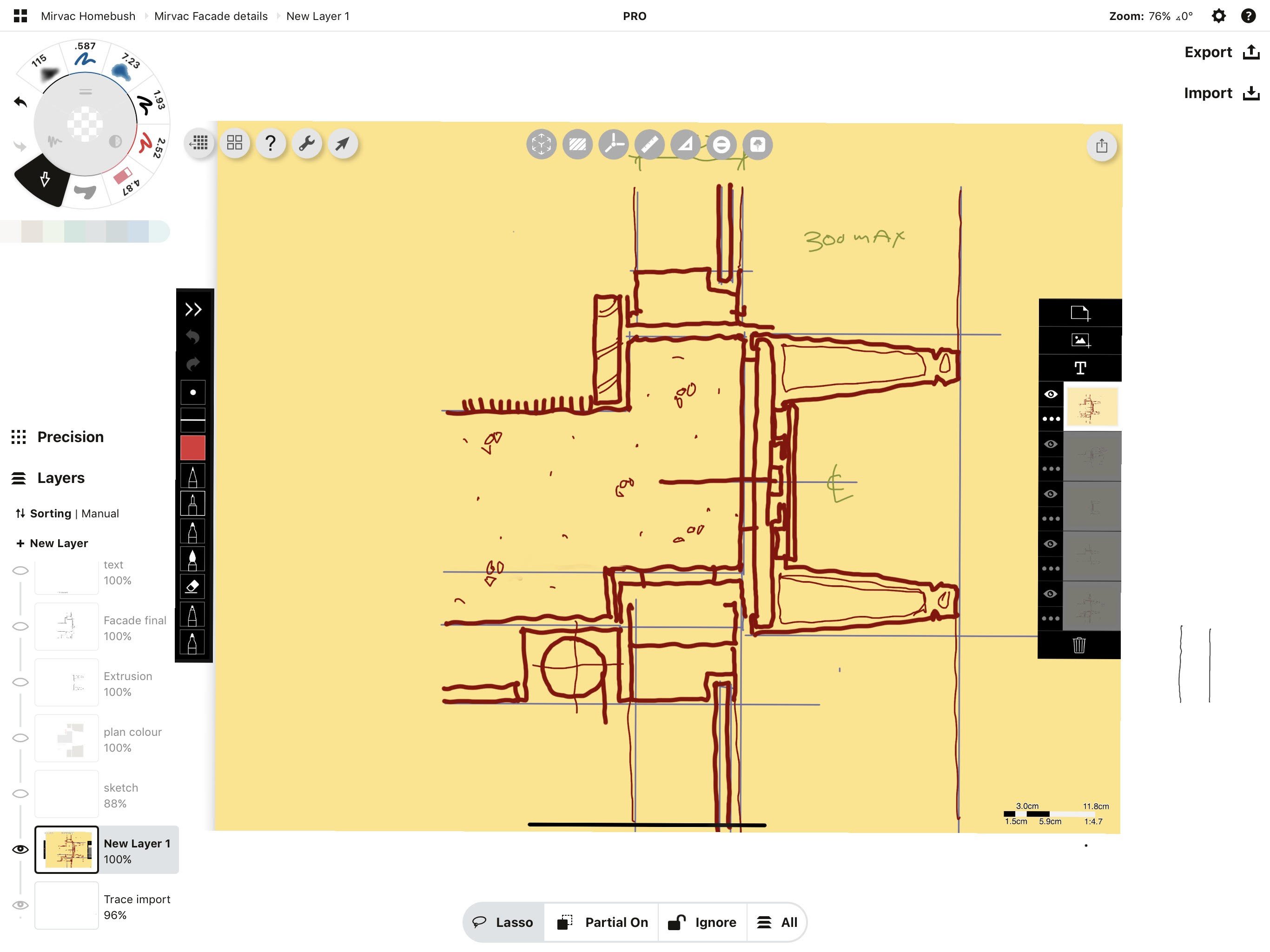
In this case, we had only a very rough concept in mind, so I started the process using Morpholio Trace to help develop lots of options and iterations quickly and intuitively. I would roughly sketch ideas in Trace, while other guys on the team would work them up pretty much simultaneously in 3D CAD for quick visualisations to test geometry and proportions.
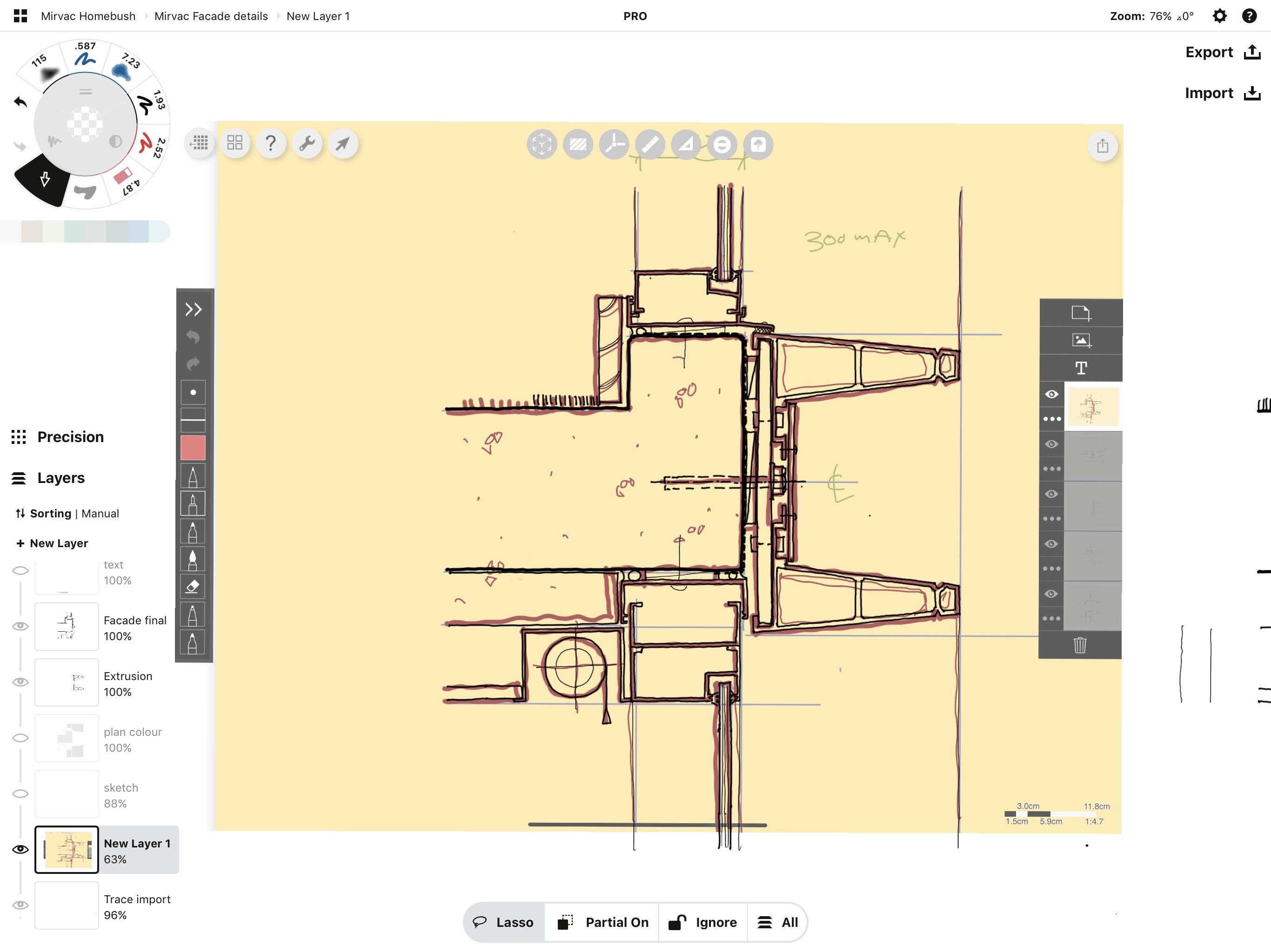
Once we were happy with the appearance and the rough detail resolution, I would bring the Trace sketch into Concepts and begin doing the final sketch. The process from here is basically the same as described previously.
I’d do the final sketch and add colour.
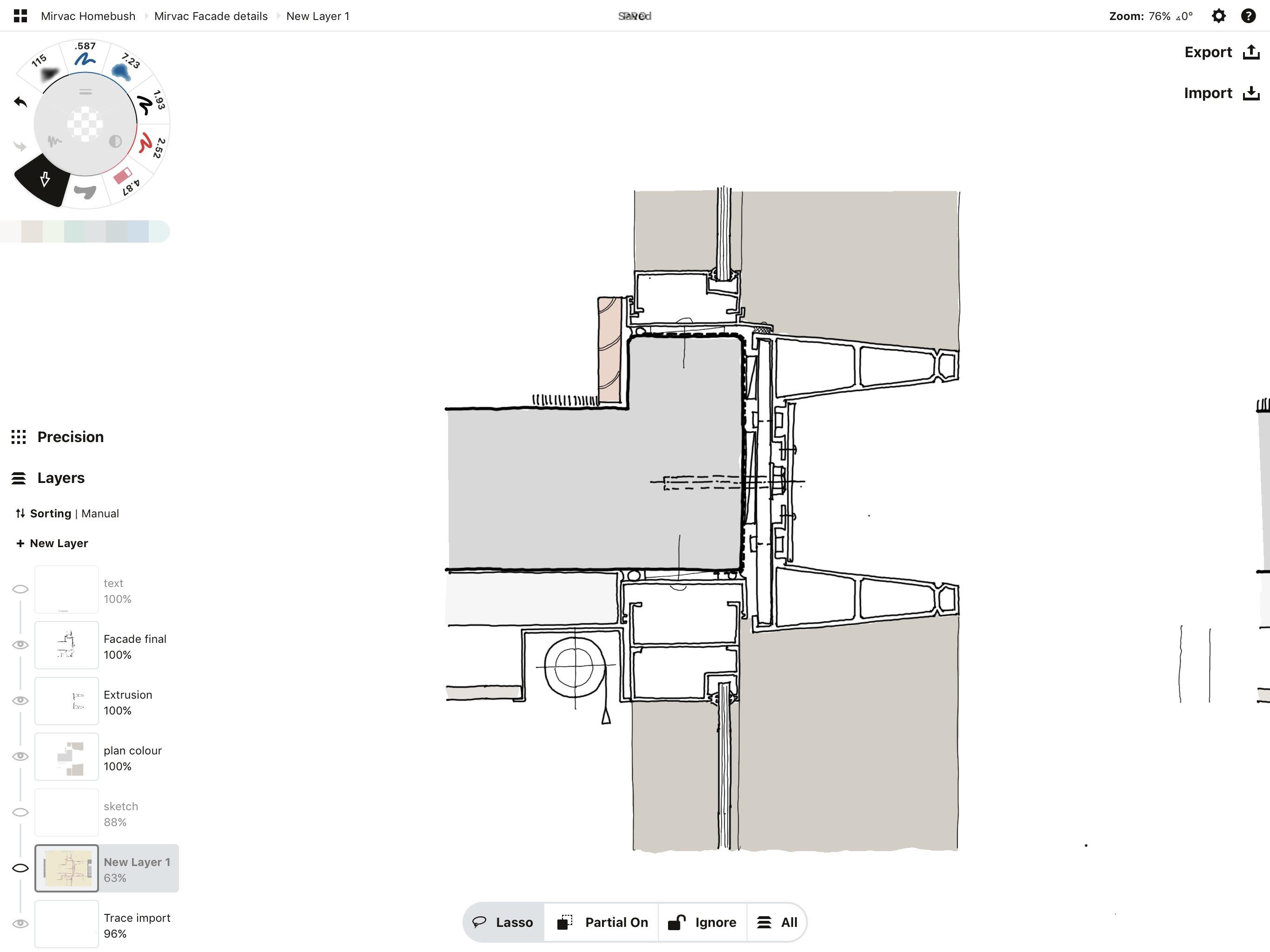
As before, I’d group / duplicate / modify to create a full suite of details covering the different conditions.
In addition, please feel free to note any features or ideas that would make your work with Concepts better or easier. This is for our team to understand — we aren’t architects but we do appreciate excellent and efficient design in a tool, and would love to know how we can help you do your work better.
As mentioned previously, I really use two tools for most of my drawing, Concepts and Trace. There are things in Concepts that I wish were in Trace and there are things in Trace that I wish were in Concepts. It is worth remembering, though, that they are philosophically different tools. Trace is a quick iterative sketch tool and Concepts is a like a CAD programme for hand drawing. They have some overlap, though….
I had a wishlist but most of the things on it have been done on various updates over the years (importing to scale, select and match colour fills, improve orthogonal drawing). Some things I’d still like to see are:
- I’d like to see Concepts have a ruler similar to Trace (which has one of the best ones I’ve used). The current process of drawing a straight line is pretty cumbersome.
- Your template functions are moving in the right direction, but from an architectural perspective they are quite limited. I’d love to see a much wider selection of people, cars, trees, shrubs, furniture etc. The graphic style of these is important. The ones you currently have are based on graphics from 30 years ago.
When I first started using Concepts, I thought it was really impressive, but I think the most impressive aspect of the app is the way it has constantly been updated with really useful new functions and refinements to old ones. It just keeps getting better!

Craig Burns is a UK-trained, Sydney-based Technical Director at BVN, an Architecture and Design practice with offices across Australia, the UK and the USA. He has led the design, detail and documentation of a wide variety of building types and scales. He periodically tutors / lectures on architectural design, and can usually be found in close proximity to a mountain bike. In an effort to avoid becoming old and crusty, he is currently trying to work entirely without paper….
Interview by Erica Christensen — Director of Community at TopHatch
Recommended
Designing Architecture Beyond the Limits - Architect Sean Gallagher discusses design workflows and strategies for competitive architectural design.
Architectural Design Sketching on the iPad - Architect Amin Zakaria shares how sketching with Concepts' grids and live Snap helps his design workflow.
Architectural Design Series - Learn architectural design sketching techniques on Concepts' YouTube channel with award-winning Architect Osama Elfar.